Brand Identity & Packaging / 2023
Anim Wines
Wine label and packaging direction
Overview
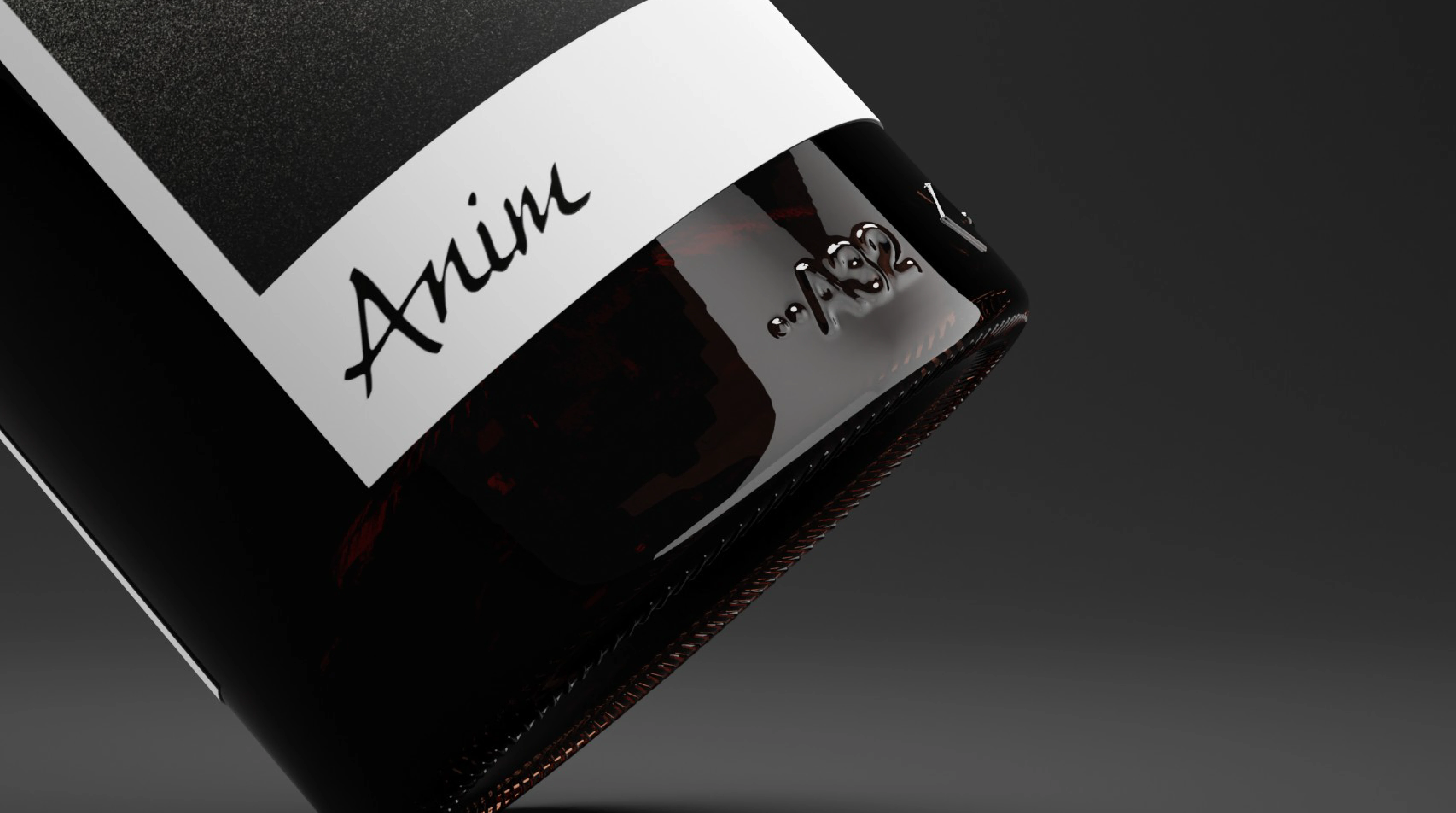
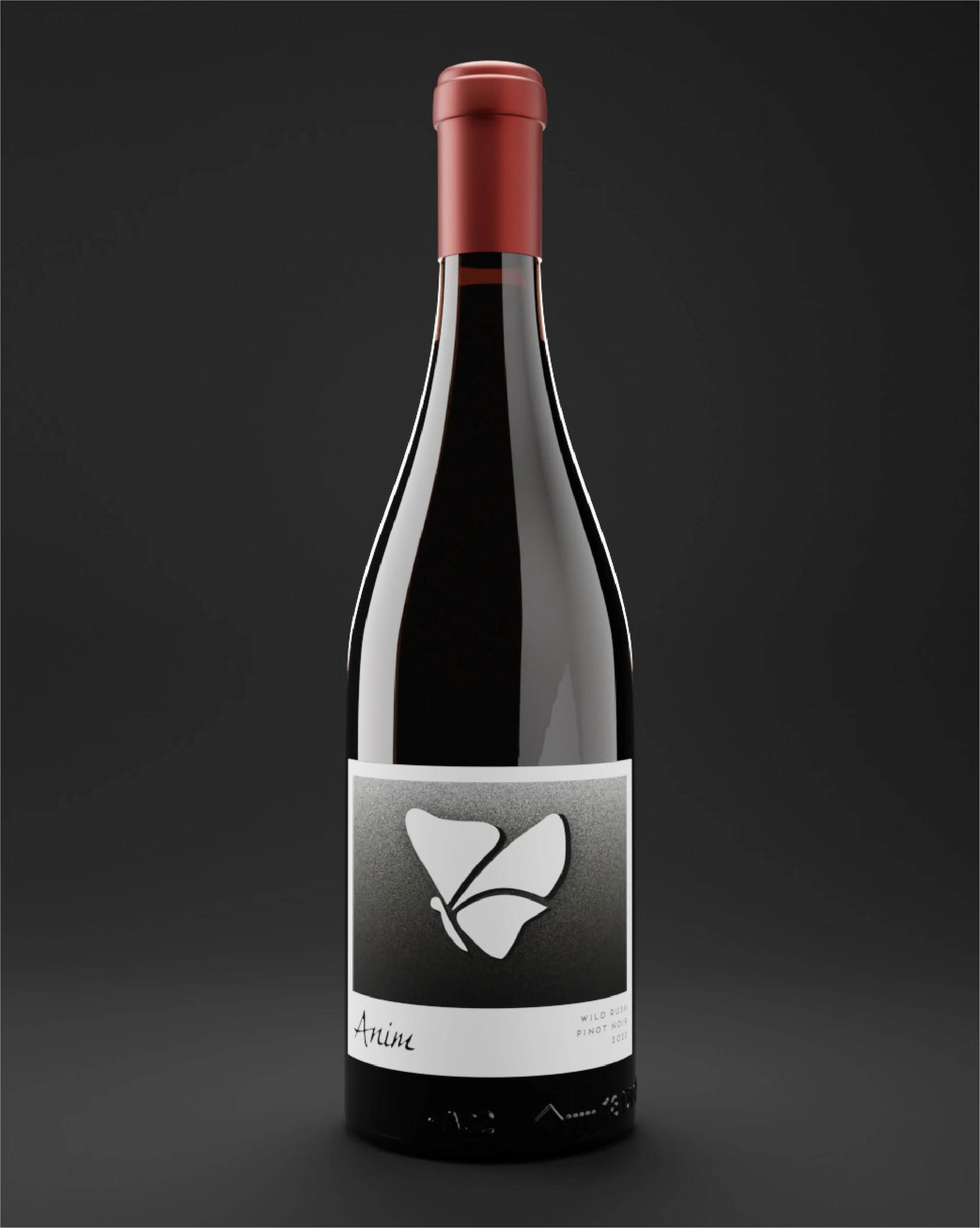
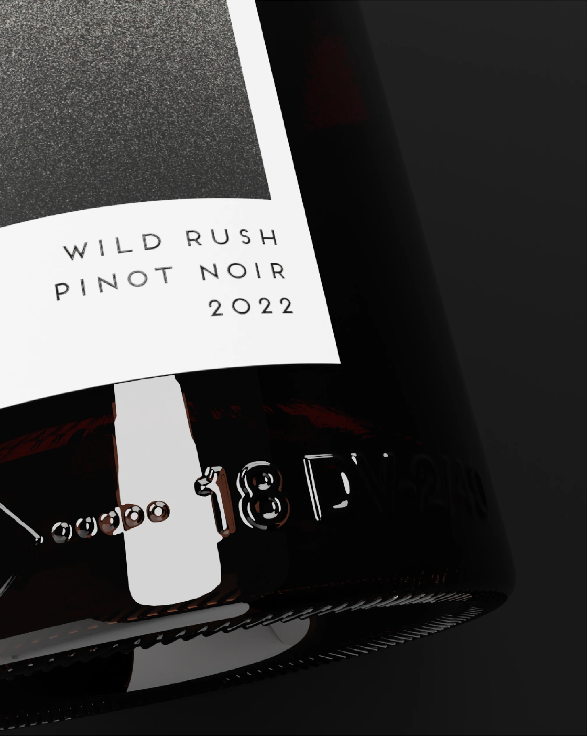
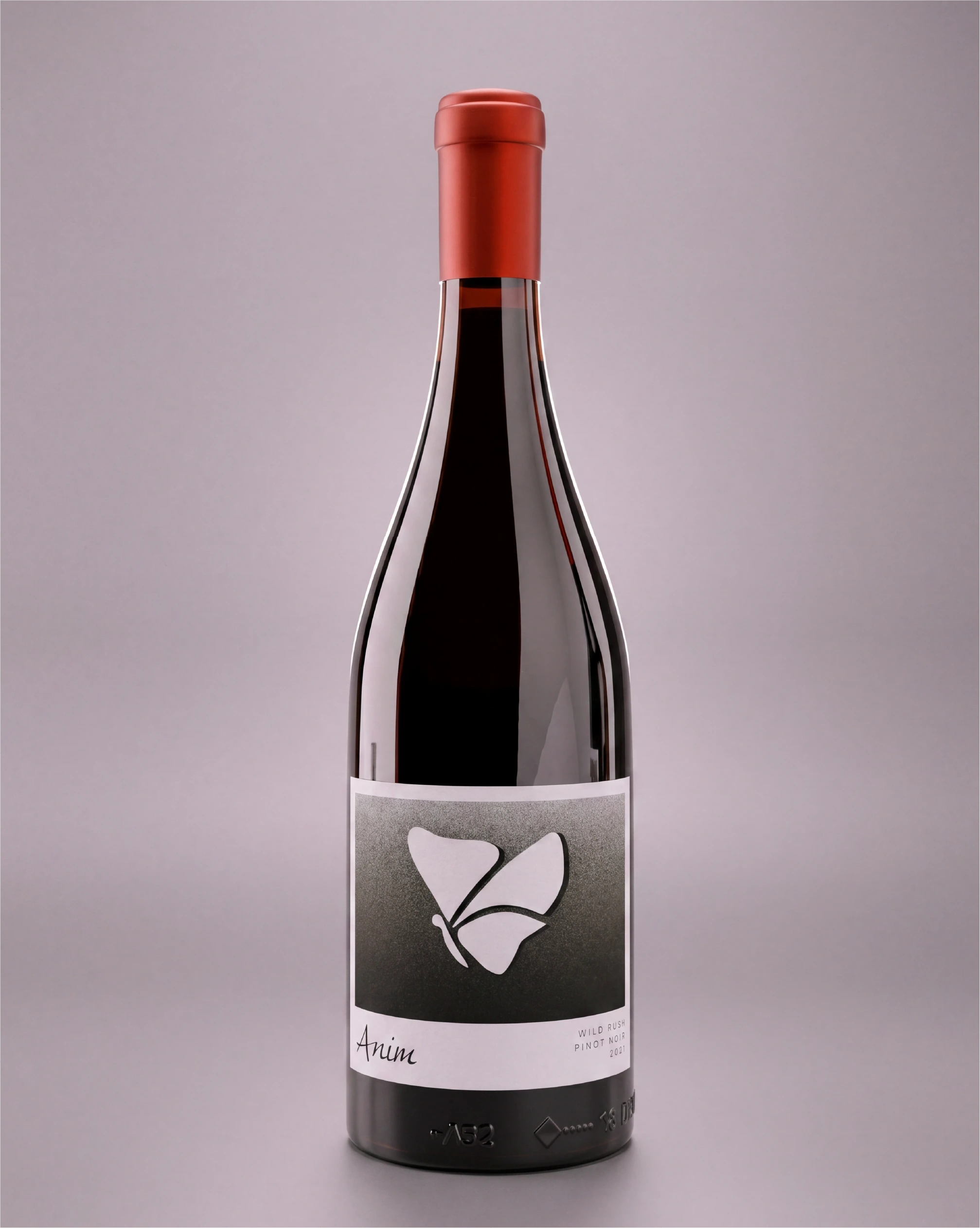
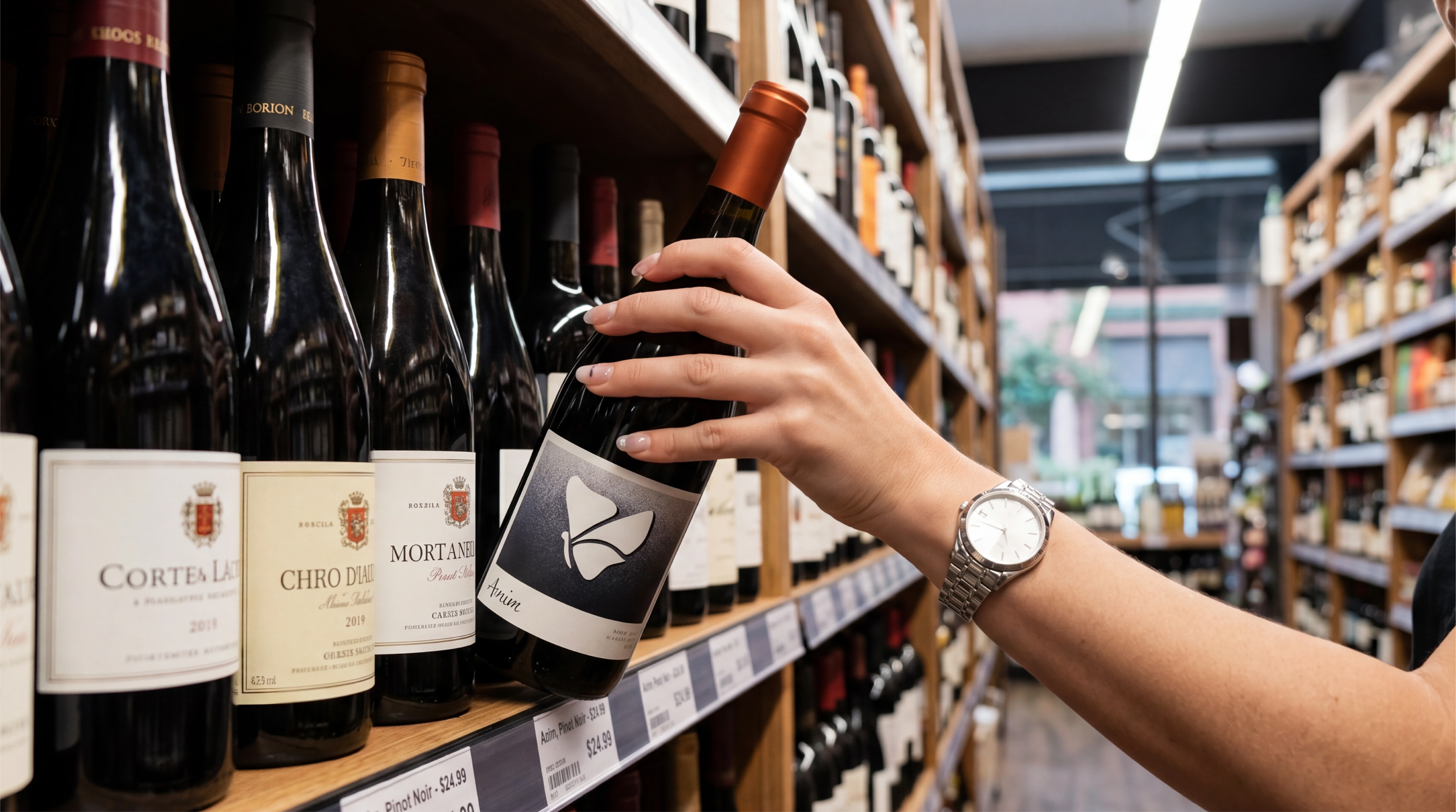
A darker, more curated label direction built to give the bottle a stronger premium read while keeping shelf clarity intact.
Anim Wines explores the balance between mood and clarity. The work leans into atmosphere and restraint, using contrast and composition to make the label feel more design-led without becoming obscure at the point of sale.
Project Info
- 01 Role — Brand identity, label design, packaging direction
- 02 Year — 2023
- 03 Sector — Brand Identity & Packaging
- 04 Location — Dubai, United Arab Emirates
- 05 Status — Public case study
Strategic Objective
What needed to be communicated.
Make the bottle feel distinctive and premium without losing clarity at shelf level or weakening the practical hierarchy of the label.
Audience
- 01 Brand Identity & Packaging stakeholders
- 02 Internal teams
- 03 Decision-makers
Communication Goal
- 01 Create clarity
- 02 Build confidence
- 03 Support review and decision-making
Information Architecture
- 01 Brand identity
- 02 Wine label system
- 03 Packaging visuals
- 04 Brand presentation
Approach
How the system was shaped.
Make the bottle feel distinctive and premium without losing clarity at shelf level or weakening the practical hierarchy of the label.
Execution
- 01 Use contrast, restrained colour, and label composition to create a stronger premium tone.
- 02 Treat the bottle and the label as one object, not two separate design surfaces.
- 03 Support the identity with presentation visuals that show how the system holds together beyond a flat artwork file.
Selected visuals
Outcome
The result.
The result is a tighter, more atmospheric identity that gives the product a clearer point of view and a stronger premium impression.
Deliverables
- 01 Brand identity
- 02 Wine label system
- 03 Packaging visuals
- 04 Brand presentation
More work